
Health
Yet Another Flawed “Fact Check” on the New Zealand Data
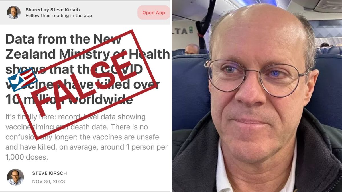
Another fact checker bites the dust.
This article originally appeared on Steve Kirsch’s Substack and was republished with permission.
Guest post by Steve Kirsch

Executive summary
Another day, another flawed fact check.
This one comes with a bonus about Professor Jeffrey Morris. Morris told the reporter that it is OK to download and analyze the New Zealand data, but not OK to talk about it.
I thought I had heard it all, but that’s a new one!
OK, so if no honest scientist is allowed to talk about this data, then how the heck can the fact checker say my analysis is flawed??
A head scratcher for sure!!!
So let’s refute the fact check first, then we’ll have some fun with Professor Morris for dessert.
The claims of the fact check
The fact check claims that the reason mortality rises after the shot is because the shots were given when deaths were at a deficit and so death rates were rising.
This is complete bullshit. What are these people smoking??? I wish I knew!
Deaths fall every August like clockwork in New Zealand:

So I looked at people who got the shot in August, 2021:

The death rate climbed 43% when it should have gone down by 22%.
Don’t need a calculator on that one.
So this “fact check” relies on a hand-waving argument with no evidentiary support. Are you surprised? These people never bother to check what they are told. They just eat it up hook, line, and sinker.
So now you know why I can’t find anyone qualified to analyze data of this type to challenge me one-on-one on the data: this data is DEVASTATING. That was just one small example.
Who is qualified to analyze this data?
Apparently very few people know how to do this right.
I see very lame attempts to analyze this data from lots of people.
There’s a common thread: each person rolls their own method!!!! Have you noticed? Each says he’s the expert, yet each has a different method.
WTF!?!? Come on. There are known right ways to analyze this data including:
- cohort time-series
- plotting time between each shot and death (age stratifying for extra credit)
- doing triangle plots of all the deaths using numbers (not dots)
A lot of people throw these proven methods to the wind. Or they execute them carelessly like William Briggs did with his triangle plots.
Only a few get them right and can crunch the data and interpret the results correctly. But these analyses aren’t out yet because they take time because the people doing them are careful.
One of the reasons this is hard is that nobody has ever seen data like this before. It’s always kept hidden. And the people with access to the data as part of their day job are told not to find any safety signals. So it is a lost art apparently.
Anyone who claims they are an expert in data analysis tells you you can’t analyze this data and find a signal is either a fool or is gaslighting you.
To date, I haven’t been impressed yet with any of the analyses that have been published by third parties, but Clare Craig is coming out with an analysis soon that I think I’ll like.
And now for dessert…
The Professor Jeffrey Morris story: did he lie to the press or was he misquoted?
Before going public with the New Zealand data on November 30, I shared the data with Professor Jeffrey Morris to see if he could refute my analysis. As a professional misinformation superspreader with millions of readers worldwide, I can’t afford to make mistakes, especially on something this big. So I wanted to see how I would be attacked so I could proactively defend my work.
Morris downloaded the data and then wrote R code to duplicate my cohort time-series analysis so he could compare his results with mine.
But the problem is that the fact check reporter seems to think that Morris didn’t download the data because it was tainted!! Here’s the excerpt:

When I read that, I contacted Morris and asked him if he lied to the reporter.
He said he didn’t. He wrote to me in a DM, ““Her wording does not accurately reflect what I said and I have asked her to correct it.”
Wow. That’s a huge misinterpretation for a fact check reporter.
Morris was able to IMMEDIATELY get the story corrected, a remarkable feat that I have never been able to accomplish with any “fact checker.”
Here’s the new text:

This is still misrepresenting the facts. Morris downloaded and analyzed the data.
You can’t rewrite history.
The proof he downloaded the New Zealand data
Here you go:

“Hey, I just met you… and this is crazy… but here’s my number… So call me, maybe?”
I am still trying to get the nice people at Health New Zealand who are ignoring their own health data to look at their own data.
I’ve been hoping to find a Carly Rae Jepsen fan over there, but so far, no such luck. Call me, maybe?

Summary
Another fact checker bites the dust. I really need to speak to the Health New Zealand epidemiologist if we are going to resolve this.
I have asked Health New Zealand many times to either publish their epidemiologists’ analysis of the vaccine data or allow me to chat with them so they can tell me how I got it wrong.
The response is always silence.
I wonder what they are afraid of? The truth perhaps?
Copyright 2023 Steve Kirsch

Dave Smith Body Slams Chris Cuomo on Stage With One Brilliant Statement

Chris Cuomo Makes Surprising Statements on Trump Trial

Chris Cuomo BOOED on Stage After Making This Fatal Error

Watch Dave Smith and Audience Demand Chris Cuomo to APOLOGIZE to Joe Rogan

Watch Chris Cuomo Get What He Deserves After Accusing Dave Smith of Seeking Attention

Dave Smith CONFRONTS Chris Cuomo Over Failure to Apologize for COVID Smears

Tucker Carlson and Top Conservatives React to Guilty Trump Verdict

Dr. Peter McCullough Makes Chilling Bird Flu Prediction

Megyn Kelly Says NOTHING Can Stop Trump Voters Now

Deaths of Covid-Vaxxed Labeled Non-Vaxxed, Government Data Confirms

Top Japanese Scientists DEMAND Withdrawal of COVID Shots

Megyn Kelly Issues MASSIVE Warning to Democrats After Guilty Trump Verdict

Putin Threatens the West’s “Dense Populations” in Response to NATO Escalation

Dr. Peter McCullough Issues Huge Warning: “Bird Flu Is the Next Disease X”

Republican Senate Candidate Larry Hogan Just Ended His Political Career with One Tweet

WHO Pandemic Treaty Defeated, at Least for Now

Japan’s Former Minister for Internal Affairs & Communications Issues Stunning Apology at World’s Biggest Anti-WHO Protest

Alarming News for the COVID Vaccinated: Study
Dave Smith Body Slams Chris Cuomo on Stage With One Brilliant Statement
Chris Cuomo BOOED on Stage After Making This Fatal Error
Watch Dave Smith and Audience Demand Chris Cuomo to APOLOGIZE to Joe Rogan
Watch Chris Cuomo Get What He Deserves After Accusing Dave Smith of Seeking Attention
Dave Smith CONFRONTS Chris Cuomo Over Failure to Apologize for COVID Smears
Tucker Carlson and Top Conservatives React to Guilty Trump Verdict
Dr. Peter McCullough Makes Chilling Bird Flu Prediction
Megyn Kelly Says NOTHING Can Stop Trump Voters Now

Megyn Kelly Issues MASSIVE Warning to Democrats
-
 Health3 days ago
Deaths of Covid-Vaxxed Labeled Non-Vaxxed, Government Data Confirms
-
 Health2 days ago
Top Japanese Scientists DEMAND Withdrawal of COVID Shots
-
 Featured24 hours ago
Megyn Kelly Issues MASSIVE Warning to Democrats After Guilty Trump Verdict
-
 Health2 days ago
Dr. Peter McCullough Issues Huge Warning: “Bird Flu Is the Next Disease X”